

A yoga room can feel calm and still look unfinished if the walls are blank. That part is sneaky. You can have good mats, clean floors, soft lighting, and still end up with a space that feels like a rental because nothing on the walls tells the eye where to rest.
Thoughtful yoga poster designs for your studio wall fix that problem, but only when they do more than fill empty space. The right poster can slow people down when they walk in, help a new student follow a pose, or give the whole room a steadier mood without shouting for attention.
I care a lot about that last part. A studio wall should not look like a random stack of “mindful” graphics from a stock site. It should feel chosen. A clean line drawing, a breathwork chart, a bold mantra, or a soft botanical print can each do a different job, and the best studios usually mix function with atmosphere instead of chasing one or the other.
The trick is knowing what each wall needs. A reception area can handle a little poetry. The practice room needs legibility. A quiet corner near bolsters wants softness. Start with the feeling you want people to have when they see the wall, and the rest gets much easier.
1. Single-Line Meditation Figure
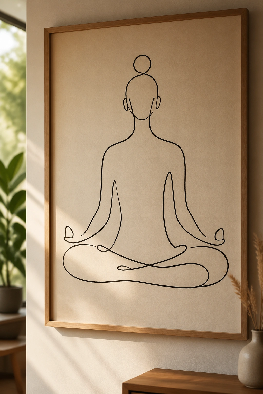
A single-line meditation figure is the poster I reach for when a studio wants calm without the usual wellness cliché. One continuous line, one seated body, almost no extra detail. It looks spare, but that restraint does a lot of work.
Why this design stays useful
The best version uses wide negative space and a line weight thick enough to read from across the room. A hairline sketch gets lost fast, especially once you frame it behind glass. I like this style in charcoal, deep olive, or black on warm white paper because it keeps the mood quiet and grounded.
A poster like this belongs near the entrance, waiting area, or any wall that feels too busy already. It gives the room a center without turning into a teaching tool. That matters. Not every wall needs to explain something.
- Best size: 18×24 inches or 24×36 inches
- Best palette: black, bone, soft clay, muted sage
- Best finish: matte paper, not glossy
- Best frame: thin oak, ash, or black metal
My rule: if the line drawing looks clever from six feet away, it’s probably too fussy.
2. Sun Salutation Flow Chart
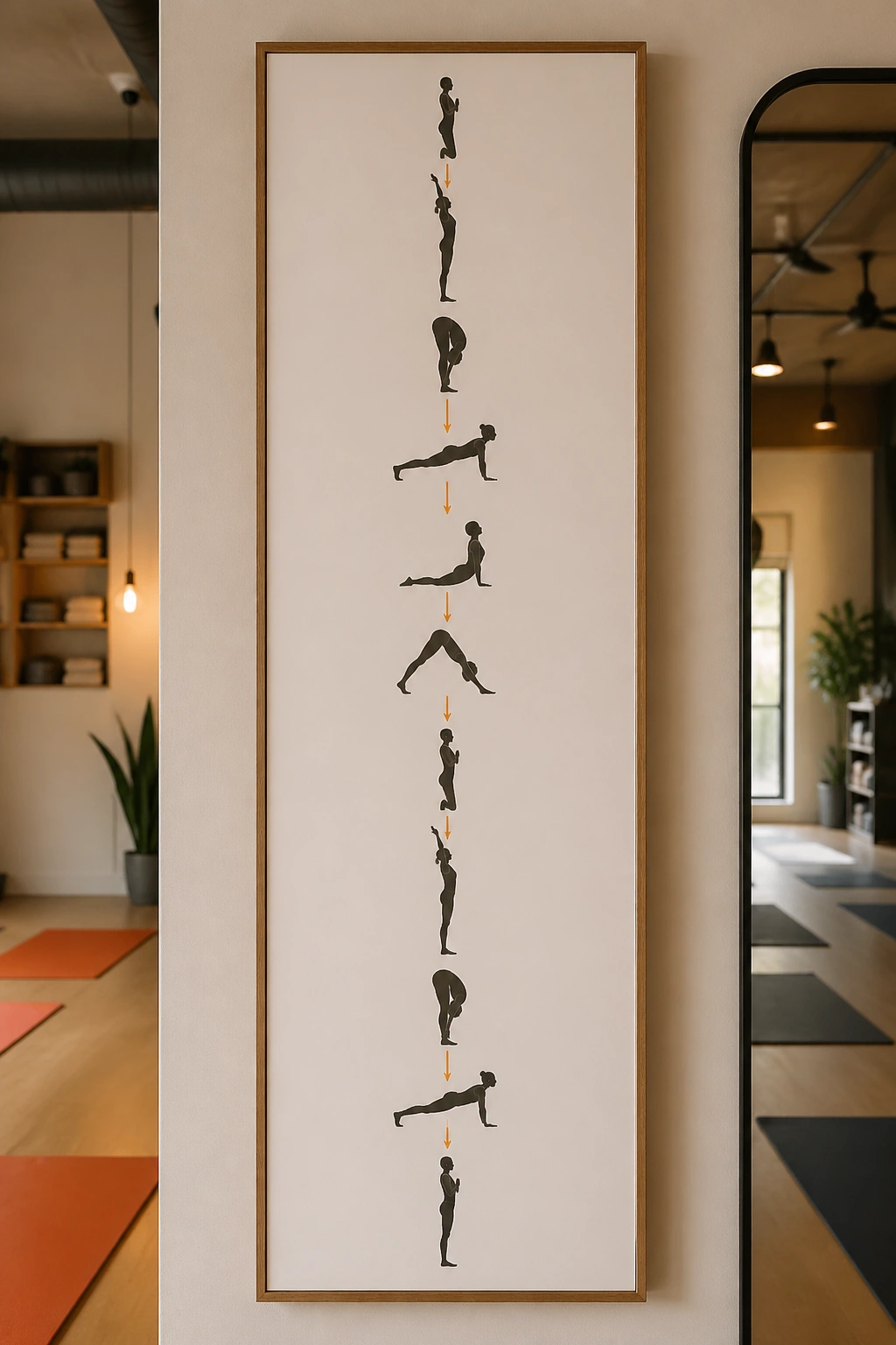
A sun salutation poster earns its wall space because it teaches while still looking tidy. There’s something satisfying about seeing the sequence laid out in a clean vertical path: reach, fold, half lift, plank, lower, cobra, downward dog, step forward, rise. Simple. Familiar. Useful.
The design works best when each pose is spaced enough that the body shape can breathe on the page. Tiny arrows help. So do clear inhale and exhale markers. If your studio has newer students, that breath cue matters more than decorative flourishes ever will.
A poster like this should feel almost like a calm map. Not a poster screaming instructions. Use one accent color for the arrows or numbers, then keep the rest of the print restrained so it can live next to mirrors, plants, or stacked blocks without fighting them.
What to show on the page
- 6 to 10 poses, depending on the class style
- Short labels under each pose
- Breath cues marked with small symbols
- A left-to-right or top-to-bottom flow, not both
The wall version of a sequence should be readable in a second glance. If someone has to stop and decode it, the design has already failed.
3. Chakra Wheel Poster
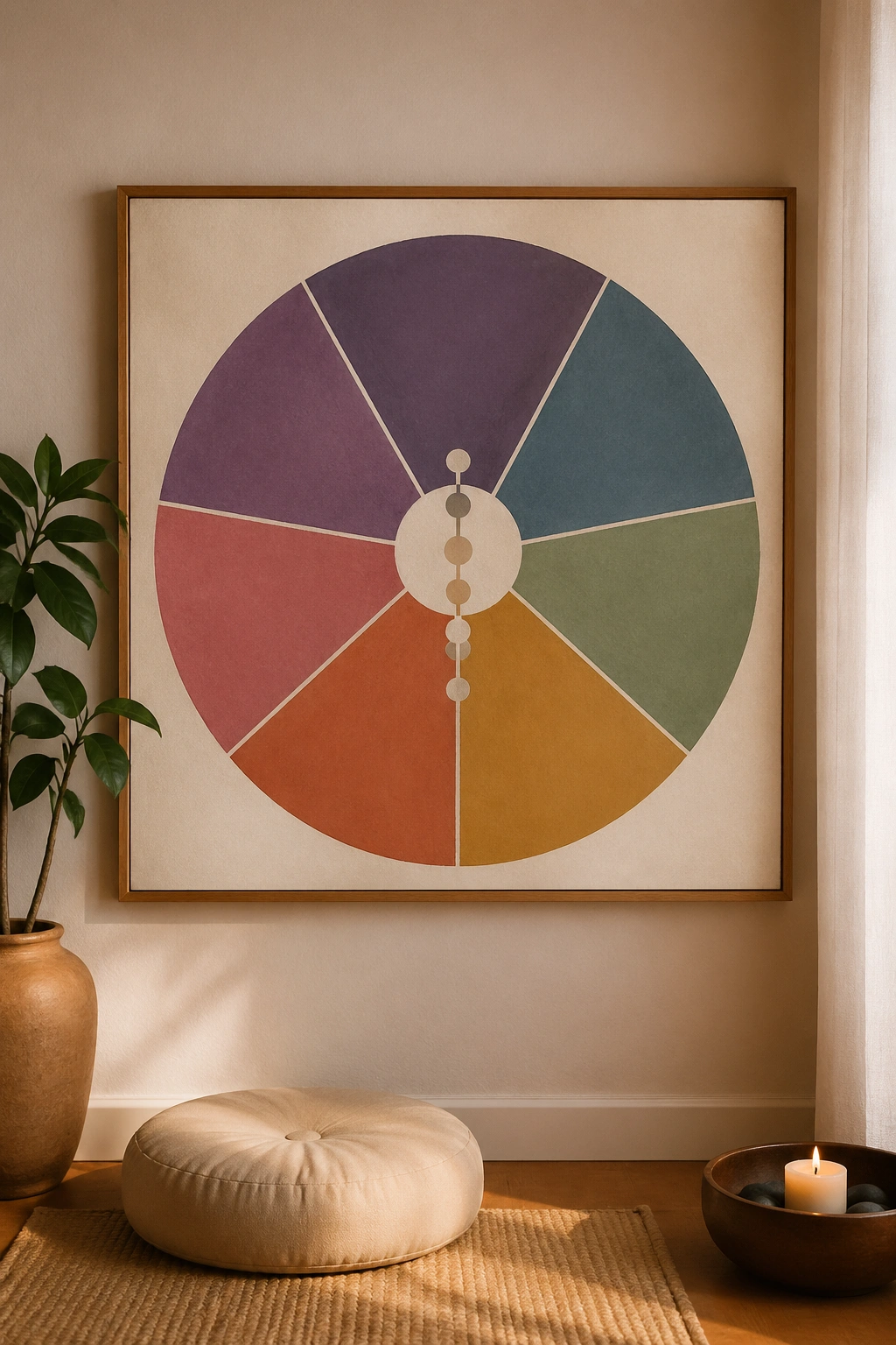
Why do chakra posters keep showing up in yoga spaces? Because the idea gives people a simple visual anchor. Seven circles, seven colors, seven centers. It is easy to understand at a glance, which makes it useful even before anyone reads the text.
The danger is kitsch. A rainbow wheel with giant labels can feel like a crystal shop flyer if the colors are loud and the layout is crowded. I prefer muted versions: dusty red, marigold, moss, teal, indigo, plum. When the colors are softened a little, the whole thing starts to look like a real design object instead of a classroom handout.
How to keep it from feeling cheesy
Use small labels and a clean center axis. Let the wheel itself do the visual work. If you want to add meaning, put one short word or phrase under each chakra rather than a paragraph of explanation.
This kind of poster belongs in a meditation room, a counseling-style yoga space, or anywhere people come to slow down and pay attention inward. It can be a touchpoint without being preachy. That’s the sweet spot.
4. Sanskrit Mantra Typography
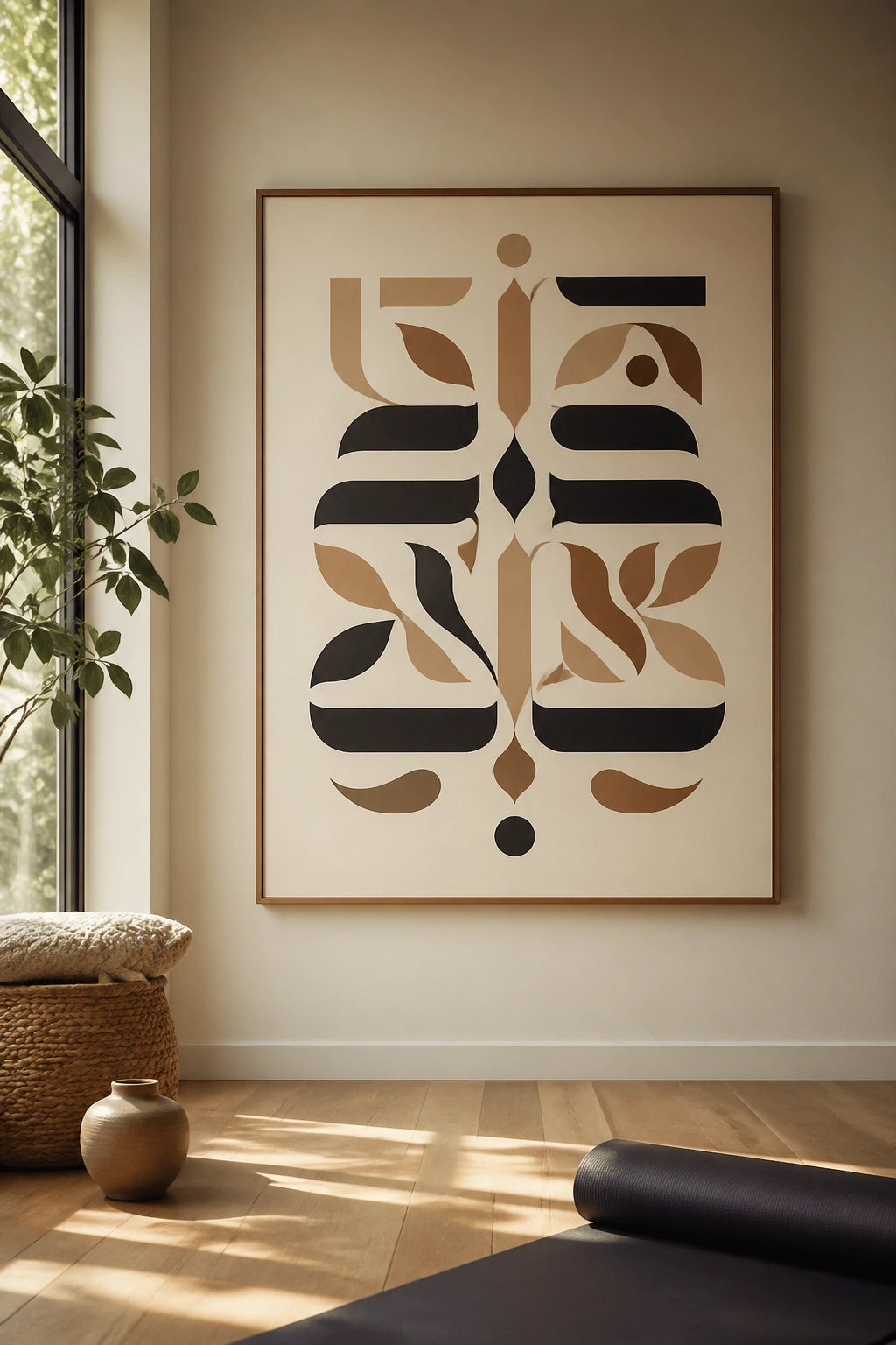
A mantra poster is all about restraint and rhythm. One line can carry the whole wall if the typography is right. “Om” works. So does “Lokah Samastah Sukhino Bhavantu.” A short English translation beneath the Sanskrit can help, but only if the layout stays clean.
I like these posters when they feel almost like a hymn page stripped down to the essentials. Centered text. Generous margins. One serif font paired with one plain sans serif, maybe. Nothing ornate enough to distract from the words themselves.
The best typography posters in a studio are not trying to perform wisdom. They simply leave room for it. That sounds fancier than it is. Really, it just means you do not cram five different font styles onto one sheet and call it mindful.
If you print a mantra in large type, make sure the spacing between letters looks intentional. Crowded type reads cheap fast. A little air around the words makes the whole thing feel settled.
5. Anatomy of Warrior Poses
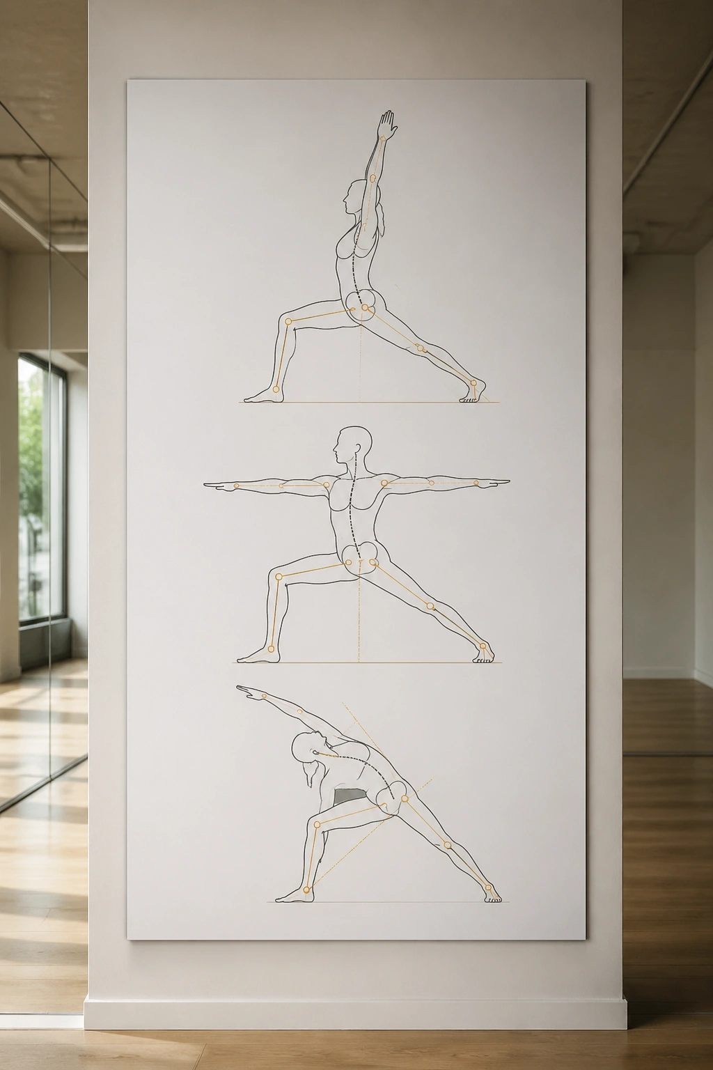
A studio that teaches alignment honestly needs at least one wall that shows how the body is supposed to stack. Warrior I, Warrior II, and Reverse Warrior make a strong poster set because they are instantly recognizable and deeply practical.
Unlike abstract wall art, this kind of poster does a job. It can show the front knee tracking over the second toe, the back heel grounding, the rib cage staying soft, and the shoulders staying away from the ears. Those are small details, but they matter more than almost any decorative choice in a room with mirrors.
What makes it different
A good anatomy poster uses simple overlay lines instead of trying to cram in every muscle in the body. You want enough detail to guide, not so much that the page becomes medical and stiff. I like clear joint markers, one or two label colors, and a neutral background so the body shape stays front and center.
- Best poses to include: Warrior I, Warrior II, Reverse Warrior
- Best labels: hips, knees, shoulders, spine, back heel
- Best placement: near mirrors or the front of the practice room
- Best use: beginner classes, teacher training spaces, alignment workshops
If your studio leans athletic, this is one of the smartest posters you can hang.
6. Breathwork Diagram Poster
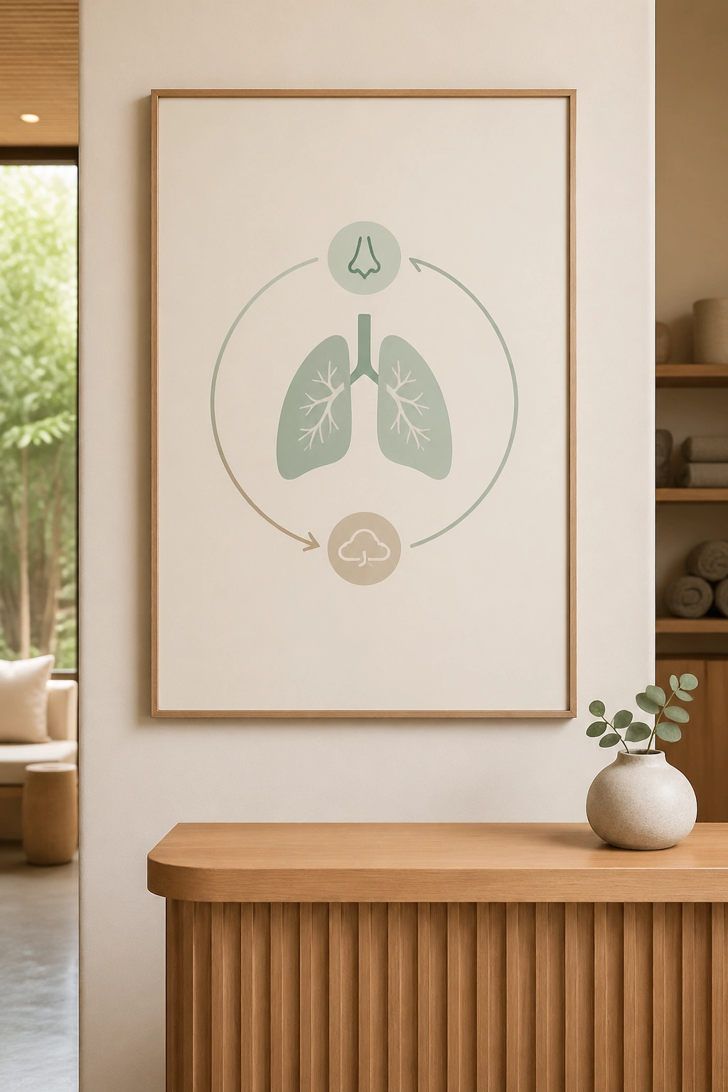
A breathwork poster should feel like a slow exhale. If it feels loud, the design missed the point. I’m partial to versions that show a simple pair of lungs, a circular breathing loop, or a stepped count for box breathing and long-exhale work.
What to print and why
Start with a clean visual structure. A circle for the breath cycle works well because it keeps the eye moving in a calm loop. Then add a count, such as 4–4–4–4 for box breathing or 4 in, 6 out for a softer pace. That tiny shift in numbers changes the whole feeling of the room.
A poster like this is especially useful near the front desk, in a therapy-informed studio, or beside the wall where students pause before class. Breath cues are easy to forget when people are tired or stressed. A wall cue saves them from having to remember.
How to use it
Keep the text short. A few words per step is enough.
Use one icon for inhale, one for hold, and one for exhale.
Choose a pale background and avoid heavy contrast if the room already has strong lighting.
A wall print about breathing should almost make people breathe slower when they look at it. That’s the test.
7. Botanical Grounding Print
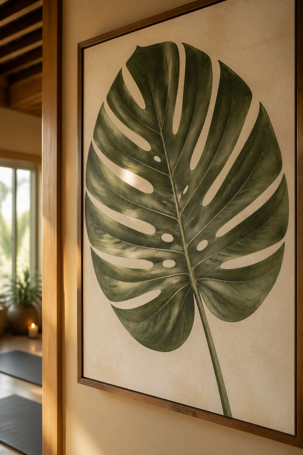
Botanical art works in yoga studios because it brings in the outdoors without pretending the room is a forest. Leaves, stems, seed pods, and a little rooted earth feel honest. They also age well. A fern never goes out of style in the way a trendy wellness graphic does.
I especially like muted botanical posters with fine detail and soft color. Eucalyptus in pale green. Dried grass in tan and oat. Monstera leaves in deep green, but not cartoonish green. Those shades sit quietly in a room and make the wood, mats, and plants around them feel more deliberate.
The nice thing about botanical work is that it softens hard edges. White walls feel less clinical. Black frames feel less severe. Even a plain hallway can look like part of the studio instead of a corridor people rush through.
A good botanical poster does not need to be packed with flowers. One stem, enlarged and printed well, can do more than a crowded bouquet. I’ll take one large leaf over a bouquet of visual noise any day.
8. Geometric Mandala Poster
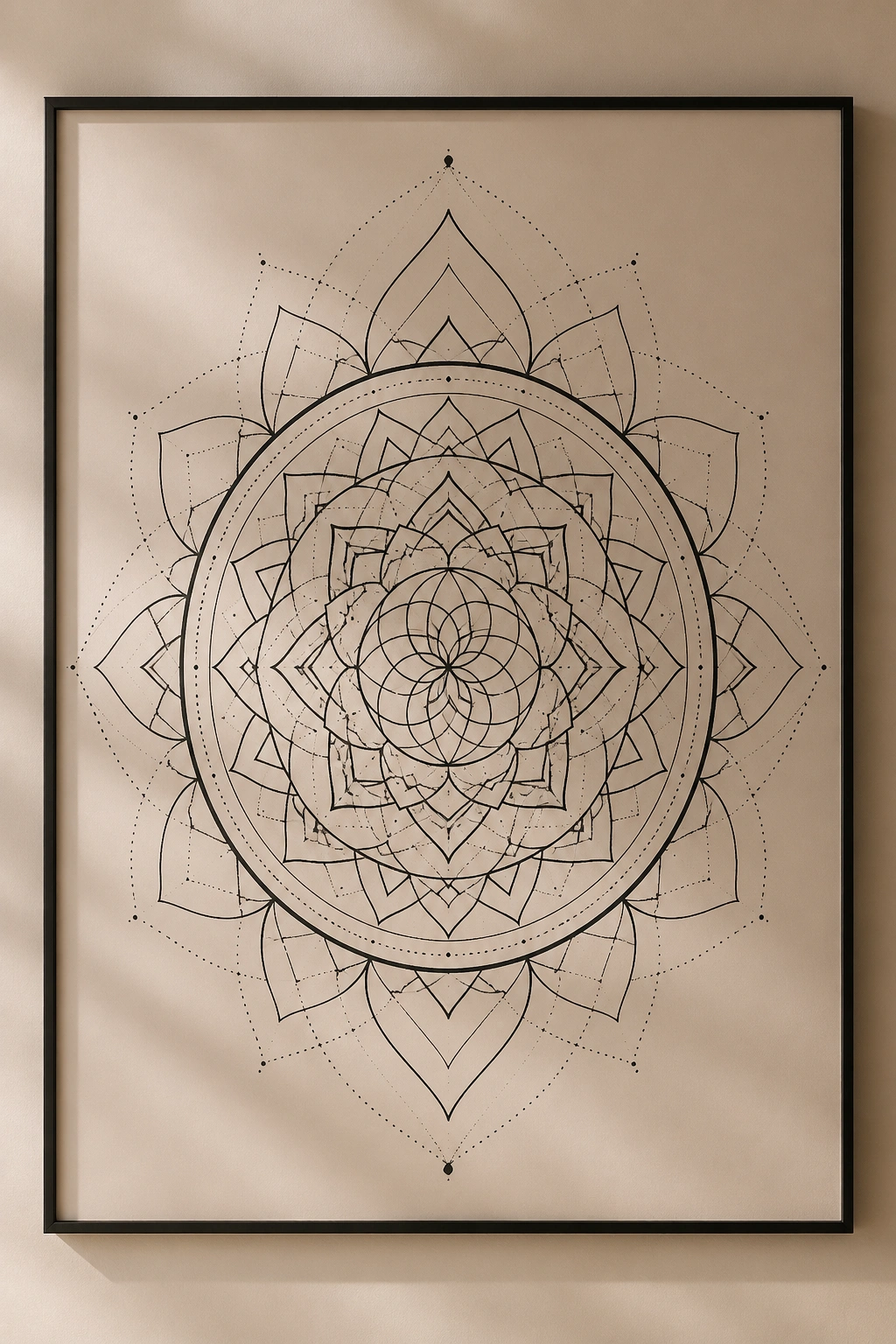
A mandala poster can calm a room or clutter it. There’s not much middle ground. The design depends on symmetry, so if the line work gets too dense, the whole thing can feel busy instead of peaceful.
That said, a clean geometric mandala is still one of the strongest yoga wall pieces you can hang. The repeating circles and radiating lines give the eye a place to settle. People who like structure tend to love this sort of thing, and even people who are skeptical usually respond to the balance of it.
The best versions use one or two inks, not six. Black on cream. Indigo on parchment. Terracotta on warm white. I’m not a fan of shiny foil here; it throws glare and turns a calm poster into a mirror under studio lights.
A mandala works especially well in a room with simple furniture. If the space already has a lot going on, the poster starts to feel decorative in the wrong way. But on a plain wall, it can be the one element that makes the room feel finished.
9. Short Affirmation Poster
Do affirmations belong on a studio wall? Yes, if you keep them short and human. The minute a phrase gets sugary or overpolished, the whole thing starts to feel fake. A good affirmation poster reads like something a teacher might actually say before class.
What to print
- Breathe first
- Move slowly
- Stay curious
- Soft face, strong legs
- Come back to the breath
- Enough for today
Those phrases work because they sound like real instructions, not slogans. They are short enough to glance at while walking past, and they do not demand too much from the room. That’s the secret. A wall message should meet people where they are.
I like this style near the entrance, the water station, or the back wall where students can catch it before class starts. Use a clean sans serif font, plenty of space, and one accent color only if you really need it.
A busy affirmation poster feels like a pep talk from a stranger. Nobody wants that.
10. Mudra Hand Gesture Set
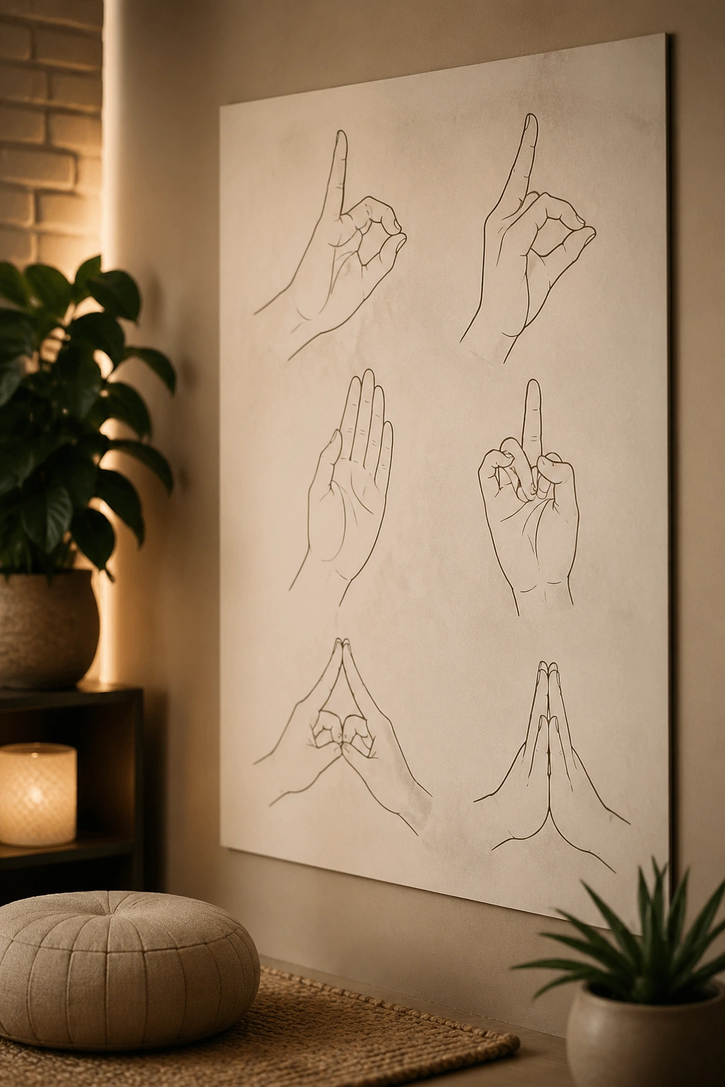
A mudra poster is one of those ideas that sounds niche until you see it on the wall and realize how useful it is. People notice hand shapes. They remember them faster than long verbal instructions, and a clean set of mudras can become a quiet reference point in the room.
Picture a poster with six hand positions, each drawn large enough to understand from a few steps away. Gyan mudra, Anjali mudra, Chin mudra, Abhaya, Varada, and maybe one more depending on the style of the studio. The hand itself becomes the art.
What makes it work
Use a neutral background so the hands stay legible. Label each mudra with a short name, then maybe one line about meaning. Keep the palms and finger shapes accurate. Sloppy hand drawings look strange fast, and there is no way around that.
This design works well in a meditation corner or teacher training room. It gives students a visual language without turning the wall into a textbook. If the studio offers breathwork or chanting sessions, the poster suddenly feels even more relevant.
A narrow wall suits this layout nicely. So does a space beside stacked cushions. The art is small in concept, but not in usefulness.
11. Studio Manifesto Poster
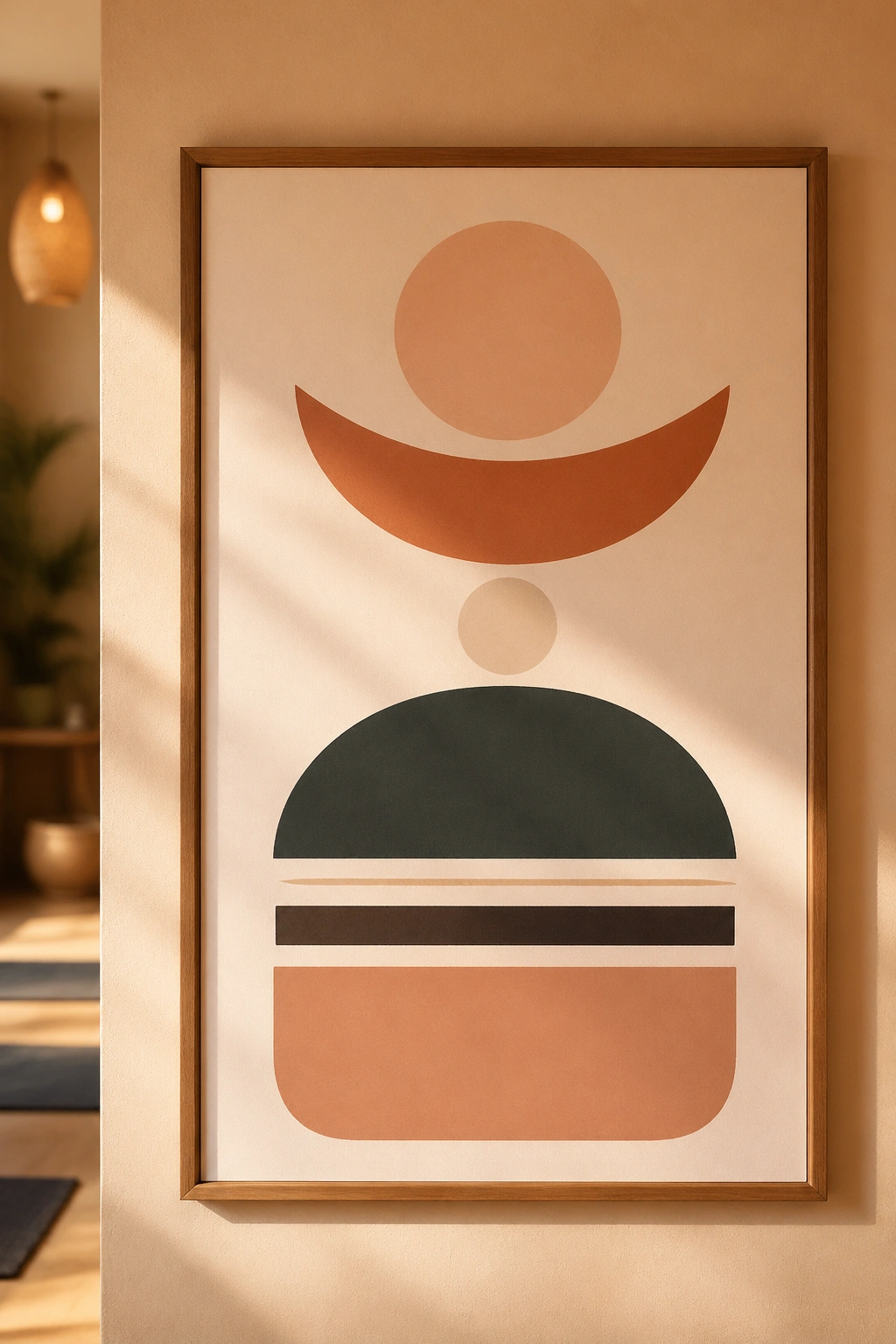
Every yoga studio needs one wall that tells people how to behave without sounding like an office memo. That wall is the manifesto poster. It can say things like: arrive quietly, turn off phones, wipe down props, respect the room, breathe where you are. Plain words. Warm tone. No lecture.
I like manifesto posters because they pull a studio together fast. They set boundaries, but they also set tone. A room without them often ends up depending on staff reminders, and that gets tiring. One good poster saves a lot of little interruptions.
The typography matters here more than people think. If the text is too large, it feels bossy. Too small, and nobody reads it. I like a centered layout with a mix of weights so the eye lands on the most important lines first.
A good manifesto poster should feel calm enough that someone can read it before class without bracing for rules. That is harder to do than it sounds. The best ones sound like a thoughtful host, not a hall monitor.
12. Alignment Cue Poster
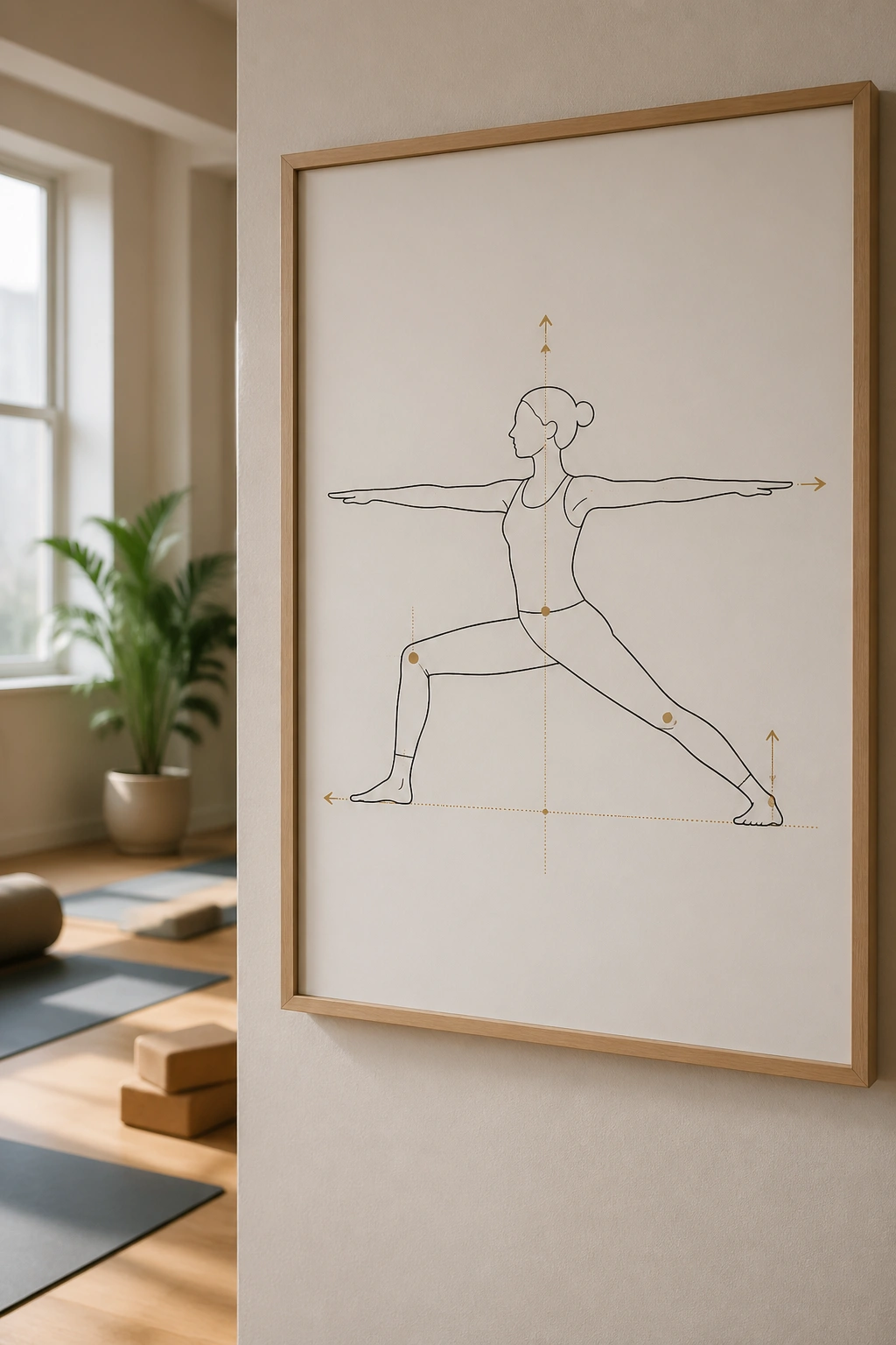
Alignment cue posters are the practical cousin of anatomy charts. They do not need to explain the whole body. They just need to catch the five things people forget when they are working hard and breathing fast.
This is where clear phrases matter: front knee tracks with the second toe, ribs soften down, spine long, shoulders away from ears, feet rooted evenly. Those cues belong where students can see them from a mat, not just while standing in line at the desk.
Best details to include
- One cue per pose
- Short labels, no paragraphs
- Simple body outlines
- High contrast text for mirror walls
- Large enough font to read from 8 to 12 feet away
Unlike a purely decorative poster, this one should feel instructional in the best way. It belongs in studios that teach mixed-level classes, especially where students need reminders without constant verbal correction. I’d hang it near the front mirrors or along a wall where people naturally glance between transitions.
The best alignment poster is useful even after the first month. That’s how you know it’s earning its place.
13. Lotus Mandala Poster
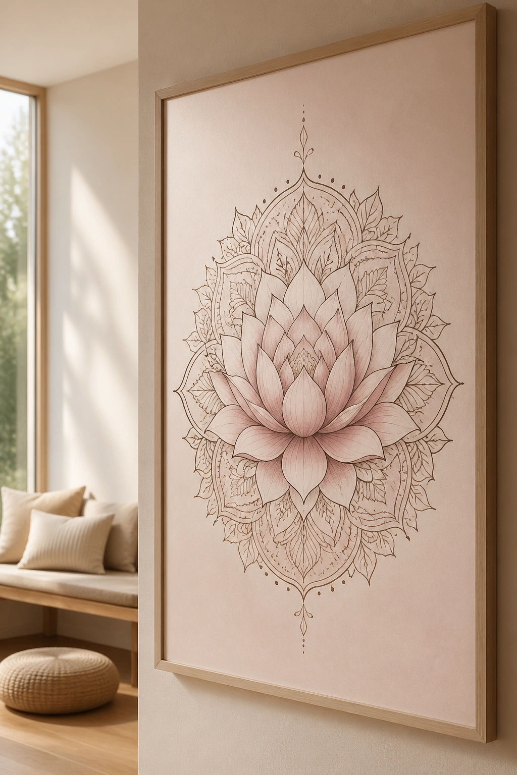
Lotus imagery can go cheesy fast. I’ve seen plenty of versions that look like they wandered out of a gift shop and never found their way back. Still, a well-drawn lotus mandala has real staying power, especially when the lines are clean and the background is left open.
What saves it is proportion. A lotus with too many petals, too many gradients, or too much sparkle starts competing with the room. A calmer version, printed in ink rather than shiny finish, feels much better. It works because the lotus shape already carries a lot of meaning; the design does not need to shout.
The poster can lean soft and spiritual or clean and graphic. I tend to prefer the second option. A pale blush, cream, smoke gray, or faded gold palette keeps the art from getting sugary. Framed simply, it can sit beautifully over a bench, in a treatment room, or near the meditation cushions.
There’s also a nice rhythm to the lotus form itself. It feels open, layered, and centered at once. That combination is why people keep returning to it.
14. Four-Element Wall Series
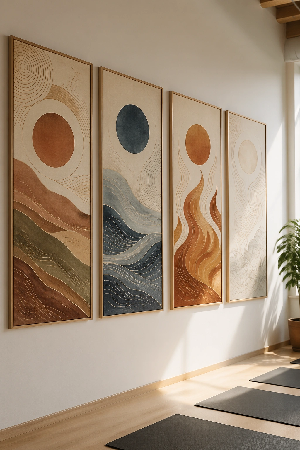
A four-element poster series gives a studio wall more breathing room than a single crowded print. Earth, water, fire, air. Four separate images, four moods, one clean system. I like this idea when a room has a lot of blank wall and needs visual variety without losing coherence.
Why a set works
Each panel can carry its own palette: earth in clay and olive, water in blue-gray, fire in rust and amber, air in pale stone and cloud white. Put them in a row, and the room gets a sense of movement without chaos. That matters in larger studios where one poster can look lonely.
You can keep the imagery abstract or lean into symbols. A stone mound, a ripple, a flame line, a drifting feather. Either path works if the line style stays consistent across all four pieces.
- Earth: grounded, low contrast, stable shapes
- Water: soft curves, layered lines, cooler tones
- Fire: sharper edges, warm color, more energy
- Air: light spacing, thin marks, open sky feeling
This series suits corridors, long side walls, or spaces that need a little rhythm between mirrors and windows. It feels intentional without being precious, and that balance is hard to fake.
15. Restorative Savasana Landscape
What should the last wall in a yoga room feel like? Soft. Not empty, soft. There’s a difference, and the better restorative posters know it. A reclined figure under a moon, a quiet mountain line, a pale sky, or a blanket-draped shape can bring the room down from movement into stillness.
This kind of poster belongs where people soften their pace: near bolsters, by the back corner, or along the wall students face during savasana. The image should not ask much from them. A gentle horizon line, a deep shade of dusk blue, a little warm light at the edge. Enough to settle the eye. Not enough to distract from rest.
I like this design because it respects the end of class. So many studios decorate for motion and forget recovery. That’s a mistake. A room that supports deep exhale needs a wall that understands quiet.
A restorative landscape print also keeps a studio from feeling overfilled. Sometimes one calm image does more than three clever ones. That is probably the least glamorous advice here, but it is the one I trust most.